
Studio/Work/Spotlight Scholars — Logo Design
Brand Identity2026Client Project

Spotlight Scholars — Logo Design

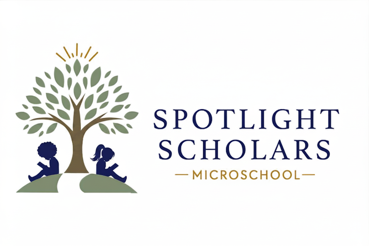
Nature-inspired logo for a Montessori microschool representing diversity, equality, and the balance of academic, nature, and STEAM learning pods.

Client
Spotlight Scholars at PediaBloom
Year
2026
Services
Logo DesignBrand IdentityVisual System
Tools
IllustratorFigma
Spotlight Scholars — Logo Design — hero
[01]

Overview

The Spotlight Scholars logo was designed to capture the identity of a Montessori-inspired microschool built around three learning pods: Academic, Nature, and STEAM. The mark communicates warmth, inclusion, growth, and the joy of discovery in a single visual statement.

[02]

Design Approach

A tree anchors the composition as a symbol of growth, rootedness, and the natural world. Two children reading beneath it represent diversity, equality, friendship, and the joy of learning across different backgrounds and learning styles. Together the imagery mirrors the school's mission: a balanced, student-centered environment where nature, academics, and creative exploration coexist.

[03]

Visual System

The palette pairs deep navy with olive green and gold accents — calm, natural, and academic without feeling institutional. A refined serif wordmark for 'Spotlight Scholars' sits above a clean sans-serif 'Microschool' descriptor, giving the logo flexibility across website, signage, print, and merchandise applications.

Gallery

Selected frames.

1 image
Primary logo — full color on white01 / 01